About:
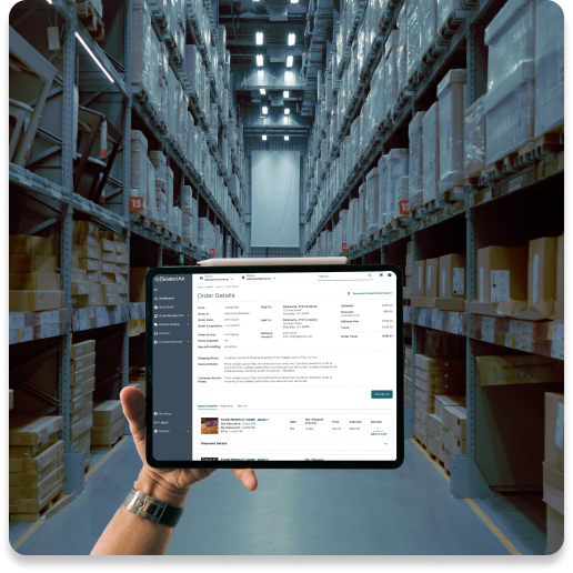
Sealed Air wanted to build its first B2B e-commerce website. Fulfillment orders on the Product Care side of the business had always come through email to customer service. Sealed Air wanted to see if it was possible to move these distributor buyers to an online ordering platform.
Objective:
Create a tool that would allow our distribution partners to buy Sealed Air products online, reducing the load on Customer Service and increasing the buyer’s visibility to the order fulfillment process.
To start, we launched a custom-built MVP e-commerce website to a select group of distribution partners.
What I did:
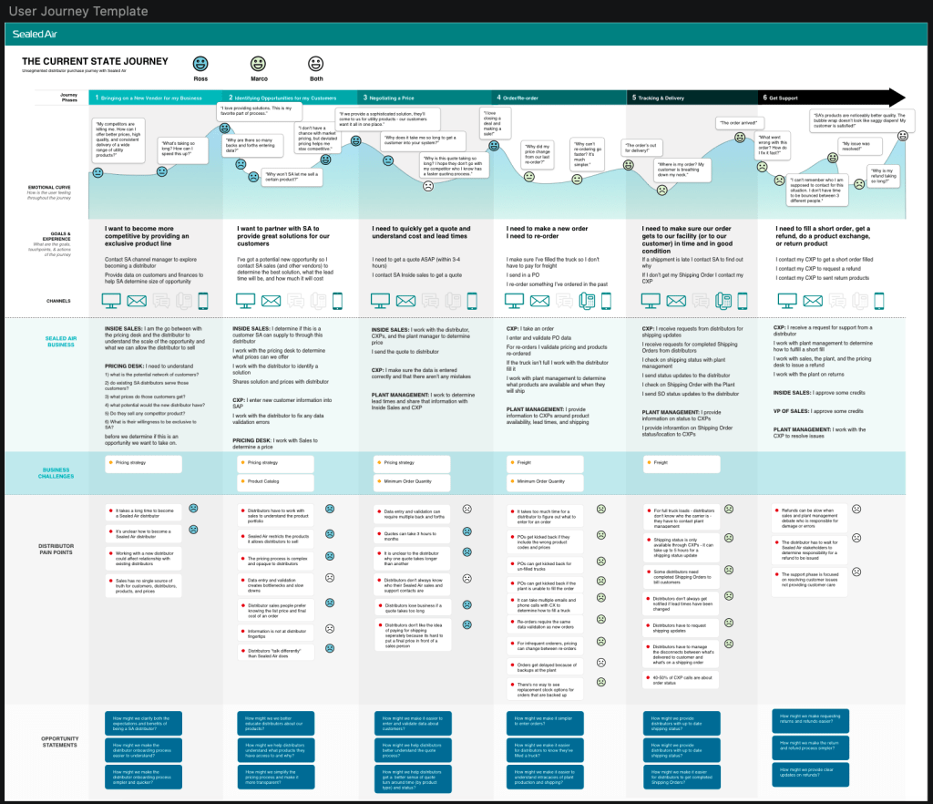
- Collaborated with a consultant team for research. This included journey maps, process flows, and personas.
- Created the interaction designs and the UI that were reviewed with the team and then sent to development. Due to an intense timeline, I was unable to first make wireframes.
- Created prototypes and test scripts to test with distributer buyers we wanted to onboard. I had frequent contact with a select few distributors that had shown great interest in what we were building.
- Worked hand-in-hand with Customer Service to understand what customers were ideal candidates for adoption.
- Monitored user interactions via HotJar, and then Full Story, regularly. With this, I was able to identify bugs in the code and also assemble user statistics that I presented to leadership.
Once the initial research was complete, the consultant team left and in a matter of weeks, I was asked to take that research and spin up the end-to-end experience. There was no time for wireframes nor was there time for testing. The product was being custom built by our in-house development team and it had to be launched ASAP. I worked with our product owners and customer service team to build the experience and UI. Within a couple months, SEE Shop brought in millions of dollars in revenue online and within the year achieved $1 billion.

SEE Shop did the following:
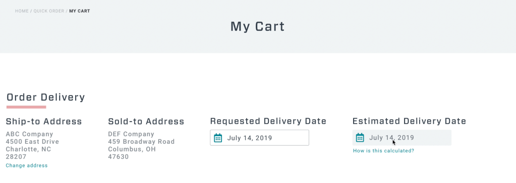
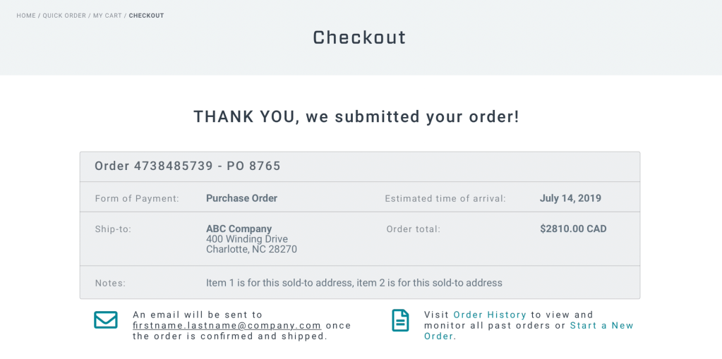
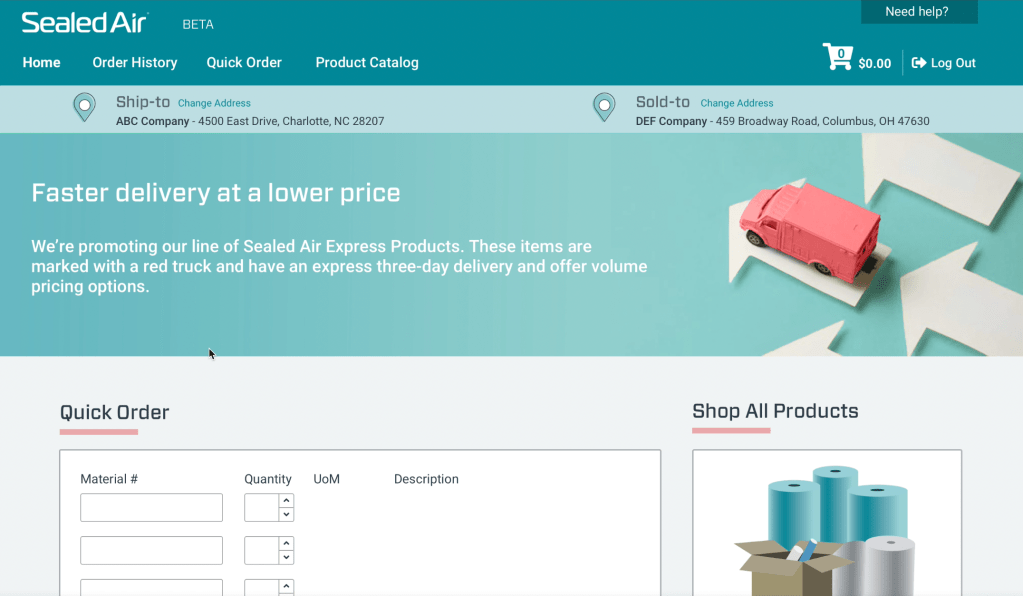
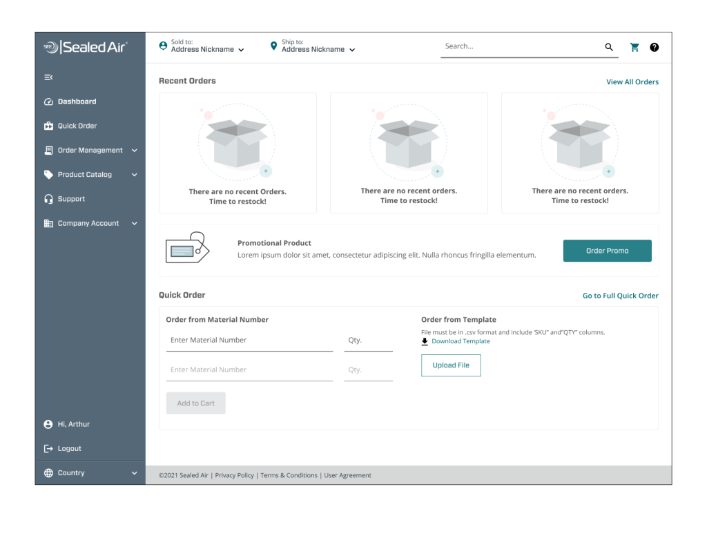
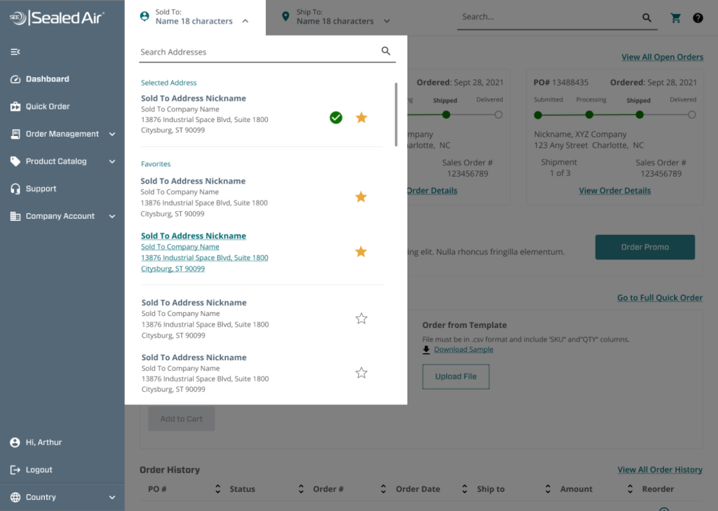
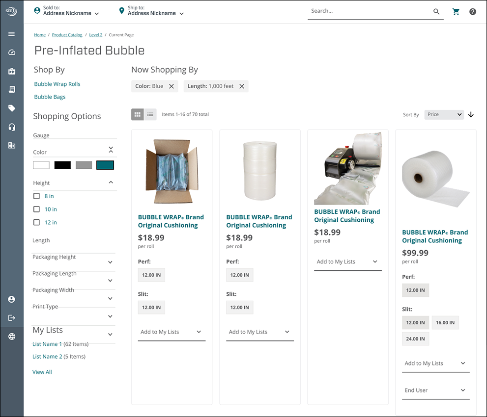
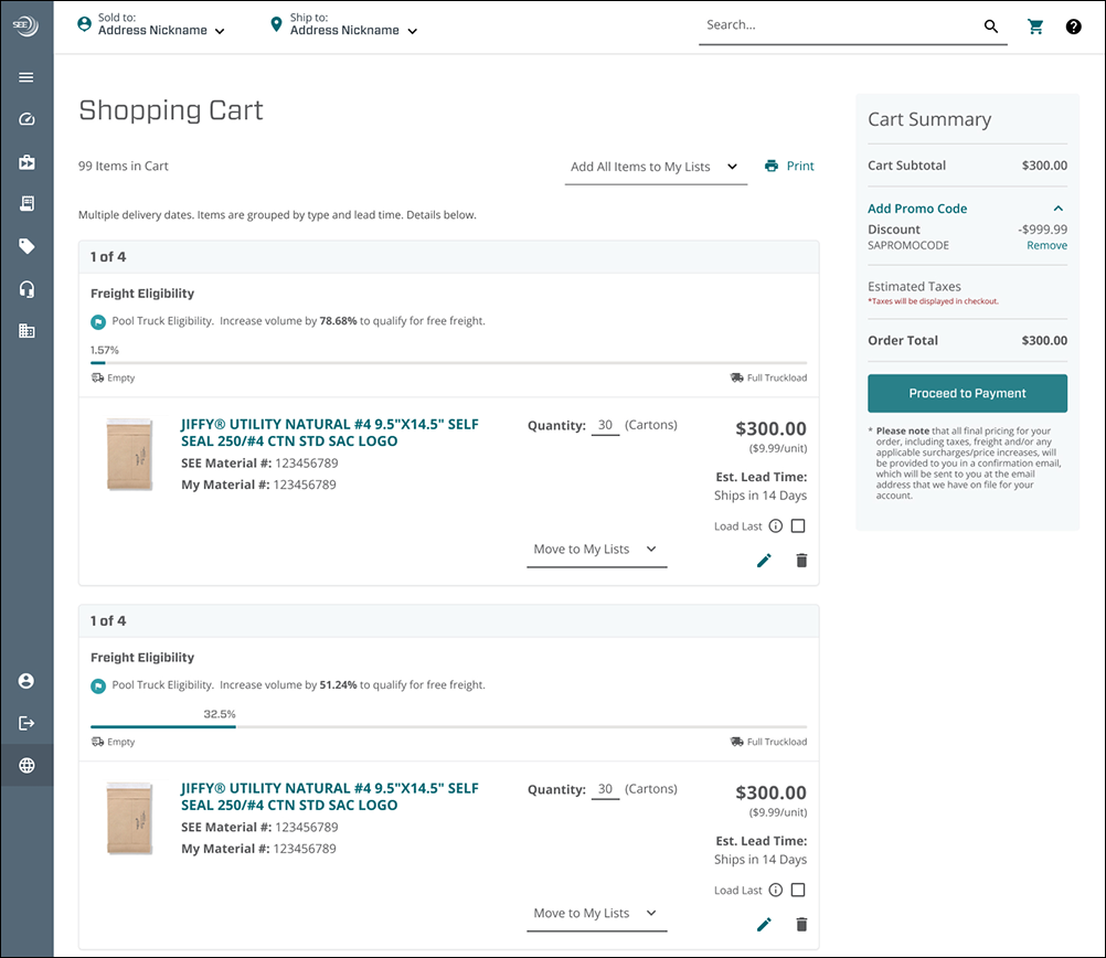
- Provided a ship-to / sold-to banner that was ever present throughout the experience. Having the correct combination dictated pricing, product availability and shipping, so it was important the user could see it and access it at all times.
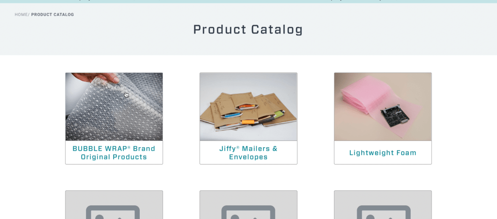
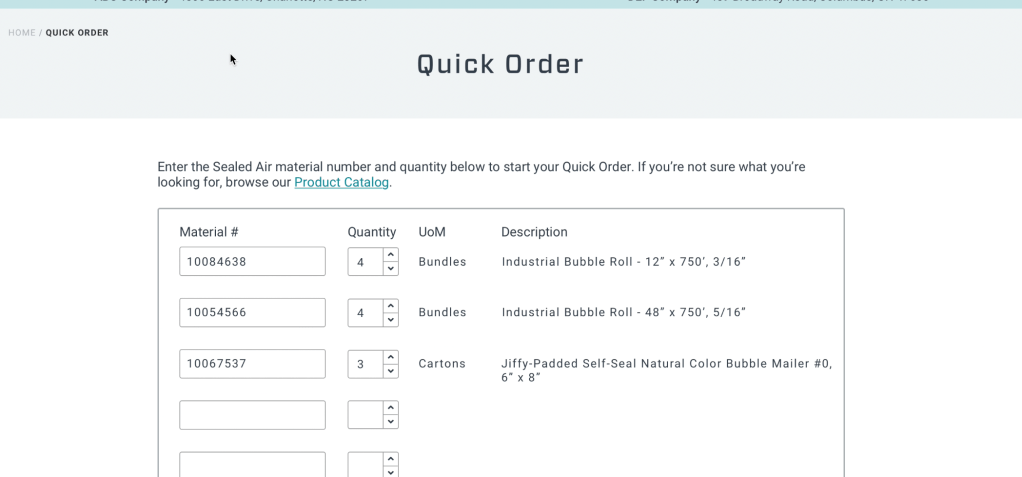
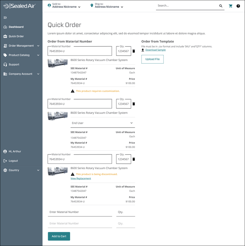
- Allowed for Quick Order. Many buyers work off a list of products that have product numbers attached, Quick Order let them input numbers quickly without browsing through the Product Catalog.
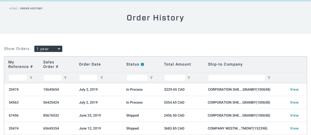
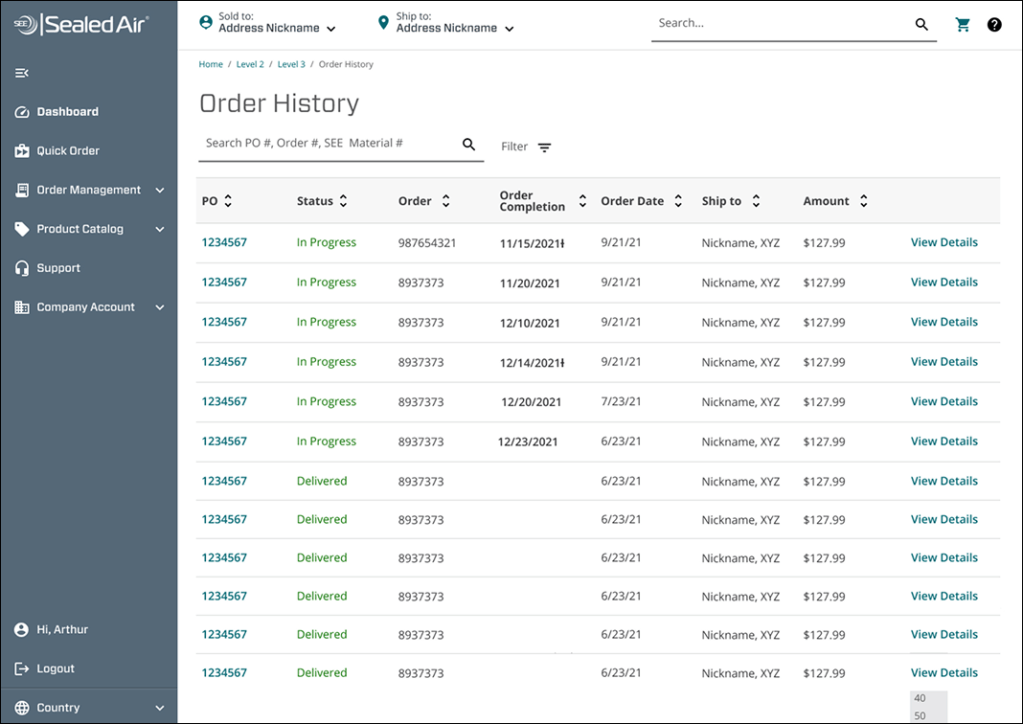
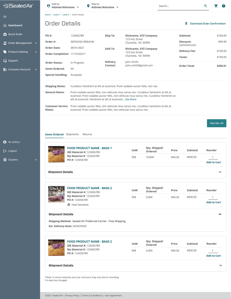
- Gave order visibility via Order History. No visibility into progress of orders was a big complaint. Now, users could regularly check the status of their order and re-order anything in the past. Repeat orders were a common occurrence.
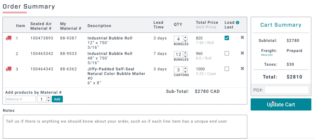
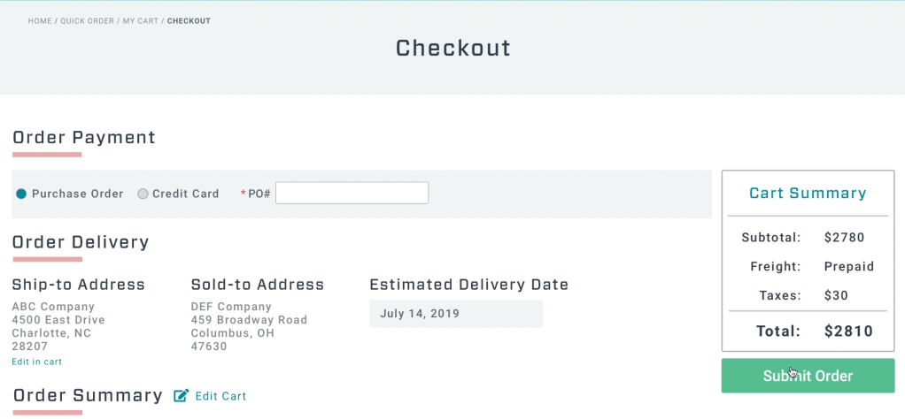
- Allowed for further refinement in Check Out. Users could easily add items to their cart without leaving the page. Removing items and adjusting quantities was also just a click of a button.
Challenges:
We worked with intense deadlines, and due to the custom nature of the build, bugs in the code were common. We found ourselves fixing things more than making enhancements. Login, in particular, was an issue.
Also, while many buyers expressed enthusiasm and gratitude for the online platform, some were more hesitant. The transition to logging in and manually entering an order from just emailing a PDF felt drastic.
E-comm 2.0: MySEE
The business made the decision that in order to build e-comm to scale quickly and make managing things like login easier, we needed to transition to the Shopify platform.
Platform: Responsive web
My role:
Senior UX Designer
Responsible for research, feature prioritization, user testing, blue prints, maps, mockups and prototypes.
Worked with PM, three engineers, content strategists and UX Research.

Objective:
To take what we had learned from SEE Shop and apply it to a Shopify product, while maintaining Sealed Air design standards and business objectives.
Goals:
- Move e-commerce to Shopify to reduce development times and bugs.
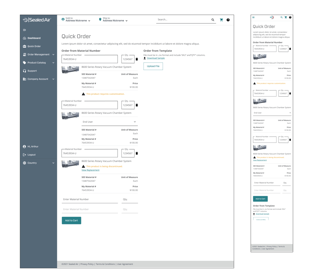
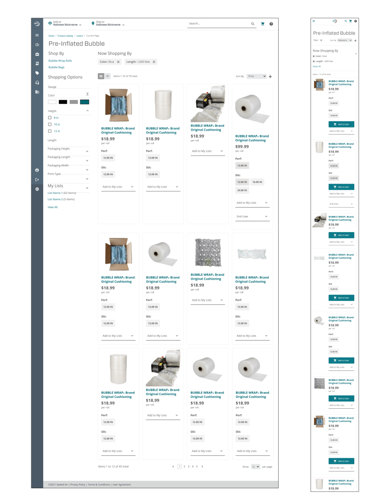
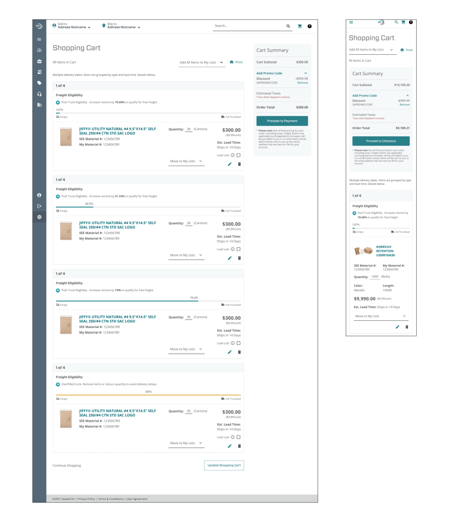
- Prioritize mobile designs.
- Modernize UI. SEE Shop was heavy on the Jewel Blue brand color. Let’s brighten it up.
- Bring more imagery to the website.
- Reduce the number of tables and give it a more B2C e-commerce feel.
- Expand cart capabilities.
- Notify user when they have qualified for free shipping.
- Allow products to be grouped in separate shipments.
- Improve layout and information hierarchy.
- Increase the information available on past orders.
- Streamline how users interact with Customer Service.
- Allow users to submit and view tickets through the e-comm help page.
- Add FAQs.
- Include a dashboard tour users could always access, to remind them of basic features and how to best use them.
What I did:
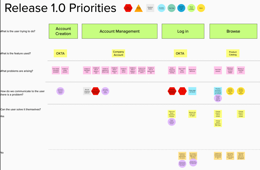
- Created process flows illustrating a customer’s journey from login to checkout.
- I highlighted positive interactions – areas we knew flowed smoothly and garnered positive feedback from users.
- I also identified areas of opportunity – spots where we still had unknowns or road blocks that could prevent adoption of the tool.
- Built wireframes and prototypes to brainstorm with product owners and designers.
- Designed desktop and mobile high-fidelity designs to deliver to development.
- Ensured Sealed Air design standards were being met
- Identified and designed features that were not out-of-the-box.
- Educated contract designers on Sealed Air business practices and processes.
To start, I thought through what the desired flow of the site would be based off what we learned from SEE Shop and what areas could we let our user down? What areas could they get stuck or need to call Customer Service? Moving this process to a touch-free experience was a big priority for the business stakeholders.
From here it was an all-hands-on-deck push for designs. We had 4-8 designers at any given time pulling together designs for the site that leveraged existing Shopify functionality.
MySEE does the following:
- Responds to screen sizes, adapting from desktop to mobile with ease.
- Brings in white space, giving the site a sense of sophistication.
- Provides product images in the Product Catalog, increasing confidence that the user is looking at the right item.
- Allows the user to favorite Sold to and Ship to addresses, making their most common selections easily available.
- Includes shipping information for individual products, increasing visibility to statuses and easily allowing re-orders.
- Improved the layout of Quick Order, allowing for imagery and more information for each product.
- Calculates how full a truck is in Cart. This communicated to the user how close they were to free shipping, a big goal for many distributors.
