About:
This project focused on redesigning the Life Insurance introduction page – a required touchpoint every user sees before starting an online quote. The existing page lacked clear content and visual hierarchy, creating friction early in the journey.
Platform: Responsive web
Tools:
Figma Design, Figma Make, FigJam, usertesting.com, Azure AI, Excel, PowerPoint
My role:
Content and Product Designer
Responsible for research, user testing, content and design.
Worked with PM, stakeholders, engineers and Project Lead.
Objective:
Strengthen the design and content to better communicate value, build confidence, and drive more users into the quote flow.
Goals:
- Enhance quality of the content. Informative copy was minimal, leaving users with unanswered questions.
- Make design responsive. Layout was the same regardless of screen size.
- Remove hierarchy confusion. Tools were not grouped together that were dependent on each other. A combination of components caused hesitation and confusion.
- Stop sending potential customers away. Users have to leave the quote page to learn more about a product.
- Make the page more inviting. Page was bare and utilitarian.
What I did:
- Reviewed past research that had been completed. Only competitive analysis had been conducted when the page was built 3 years ago.
- Analyzed the page for usability issues. I then conducted my own competitive analysis and presented my findings to project management and stakeholders. The team agreed the page was long overdue for some TLC.
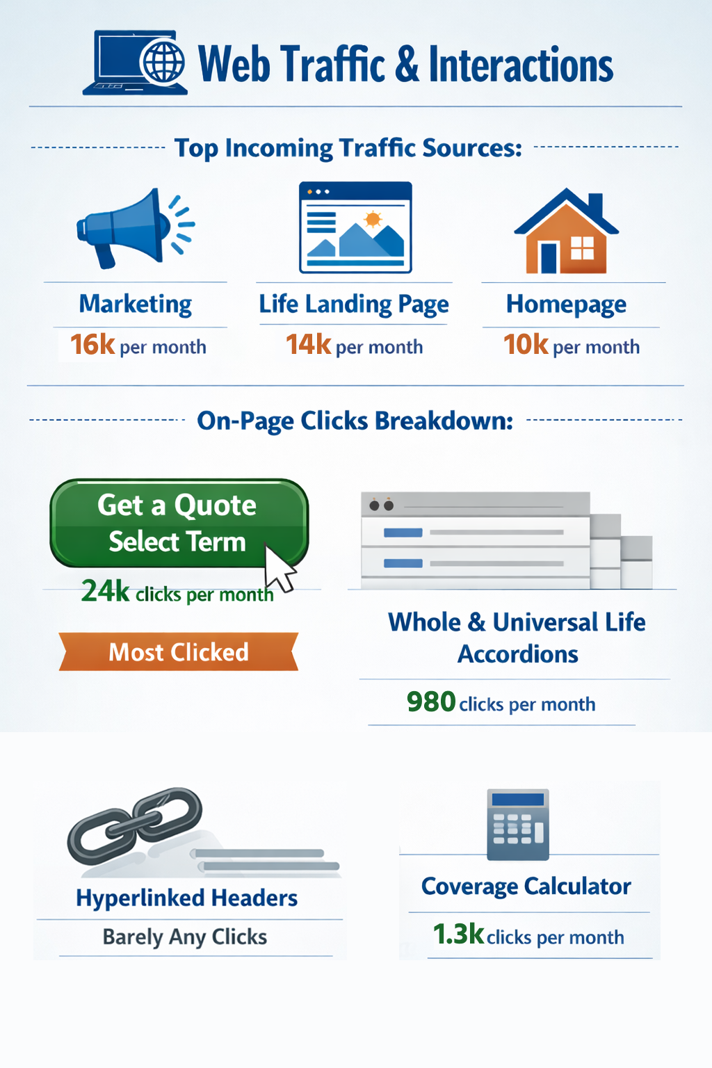
- Gathered analytics. We were interested in where users were coming from and what they were interacting with on the page.
- Based on completed research and my own analysis, we identified “easy wins” for the page. The current experience had to be moved over to the new design system. We saw this as an opportunity to fix obvious, low code issues while transitioning to the new design system, we called this Phase One.
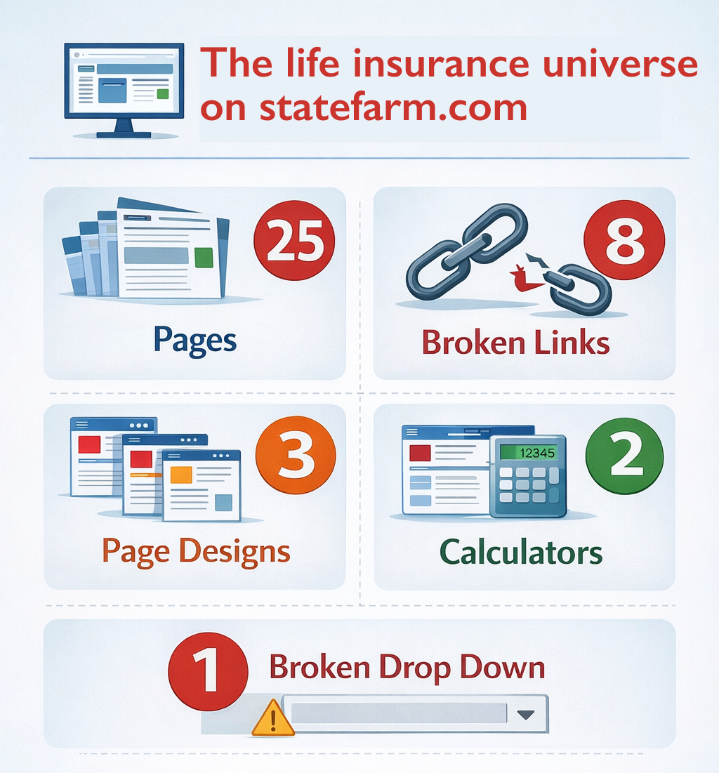
- Consecutively, I did an audit of the experience of researching life insurance on statefarm.com. I discovered the life universe contained 25 pages, 8 broken links, 3 page layouts, 2 calculators and 1 broken drop down link. Not a great experience for someone trying to learn about life insurance with State Farm.
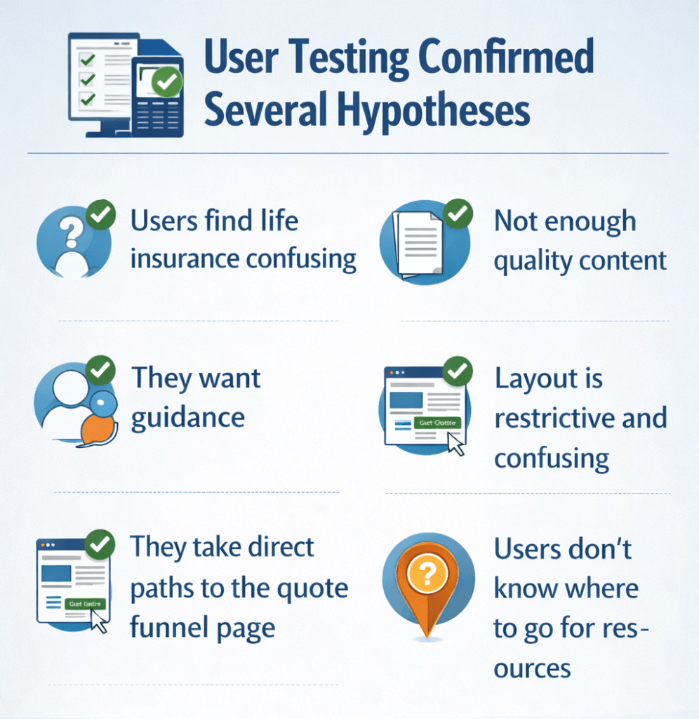
- User testing. In order to move forward, we wanted to confirm our theories on the page. I conducted eight moderated usability tests using usertesting.com. Each test was 60 minutes and we moved through:
- Contextual inquiry. I sought to understand how people felt about life insurance, what they knew about it, how they researched it, etc.
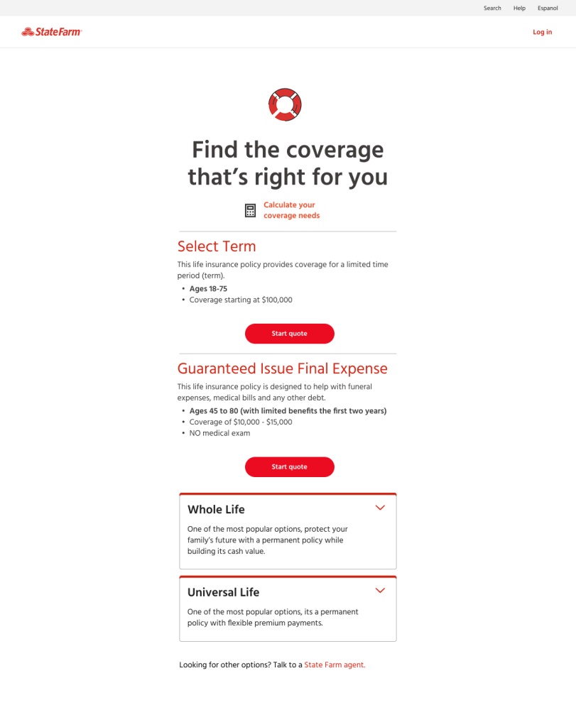
- Current usability test. I transitioned testers to statefarm.com and gave them the high level scenario of wanting a life insurance policy quote with State Farm. I observed where they went and asked questions along the way, ultimately landing on the current funnel page where they confirmed many of my suspicions.
- Conceptual usability test. I finished the interviews by sending them a conceptual prototype. We tested ideas around imagery, charts, layout and content.
- I used Azure AI to synthesize the testing results, condensed it into a presentation and reported it out to stakeholders and leadership.
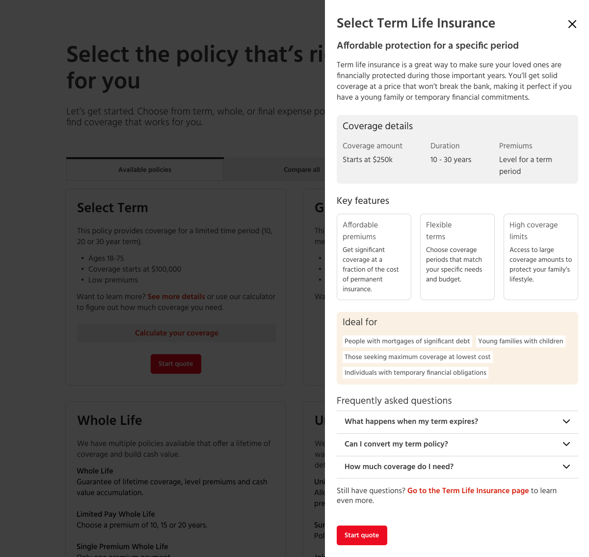
- Phase Two. Taking the findings from the user testing, I mocked up a Phase Two design using Figma Make. This includes adding imagery, a comparison chart, drawers that hold more information (rather than directing them to a page) and an optimized layout for both desktop and mobile. This design is being completed now and we look to move to development in Q2 of 2026.
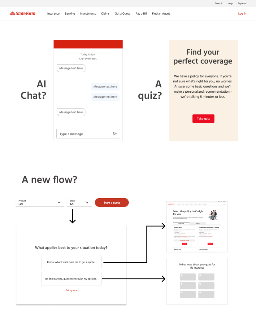
- As that work moves forward, I will start Phase Three. This phase introduces more guidance for the users. This could be an AI chat or a quiz or questionnaire. All users expressed a desire for us to do thinking for them; life insurance can be a heavy topic and people want to trust we have their best interest in mind.
Analytics
Understanding where users were coming from and what they were interacting with helped color in the picture…but we still had questions. Such as:
- How much life insurance knowledge does someone have when they reach this page? Do they know what they want?
- Why aren’t they clicking the hyperlinked headers? (not needing to vs not knowing it’s possible)
- How do people feel about the quality of the content?
- Do they understand what the coverage calculator is and that it’s associated only to Select Term?
User testing
Using the platform usertesting.com, I led eight moderated user tests. Each test lasted 60 minutes. We started with contextual inquiry, asking about their understanding of life insurance, whether or not they have it, how they research it, etc. From there we transitioned to testing the current experience and ended on a conceptual prototype.
I collected the testing transcripts and used Azure AI to synthesize the results. I transferred the insights and action items into a PowerPoint deck and shared out with leadership.
Enhancements
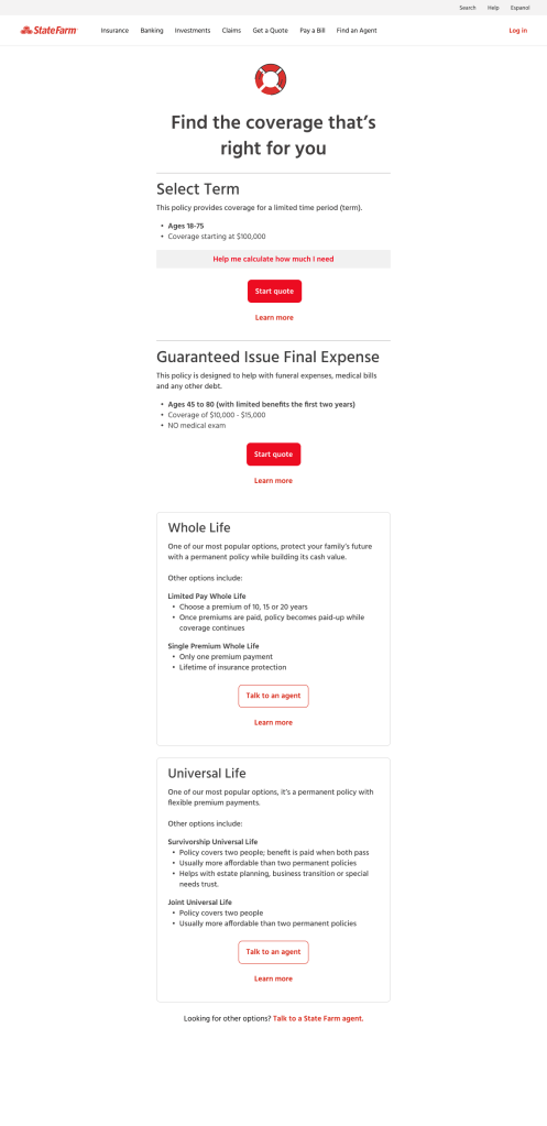
To keep momentum, we have broken the work into three phases. Phase One is about quick fixes while transitioning the page to the new design system. It will include:
- Relocating the coverage calculator to better associate it to the Select Term policy.
- Remove accordions, keeping information readily available.
- Remove hyperlinked headers that no one knew to click on. Add “Learn more” CTA’s.
- Maintain same overall layout and content.
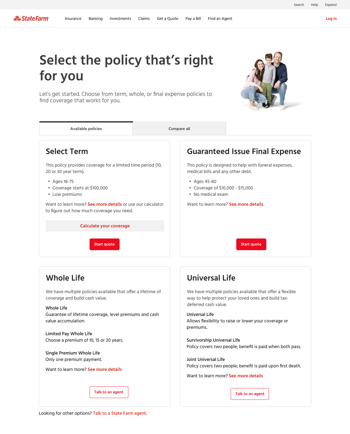
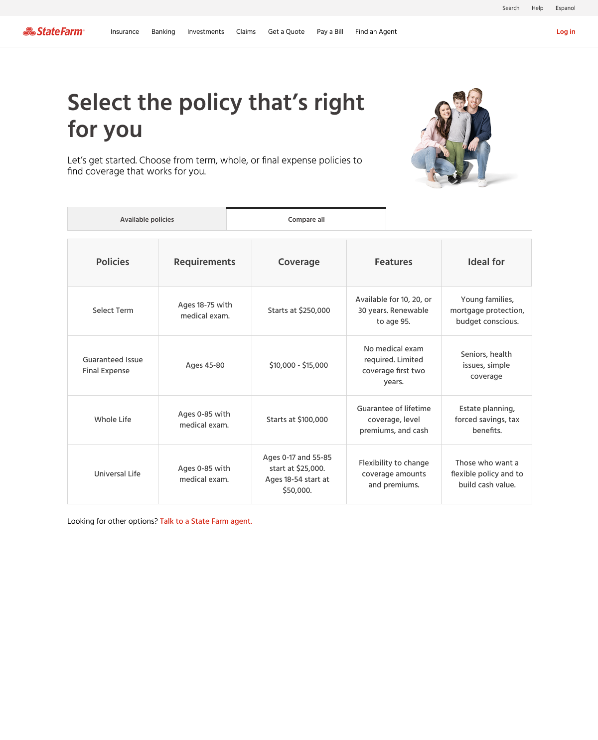
Phase Two
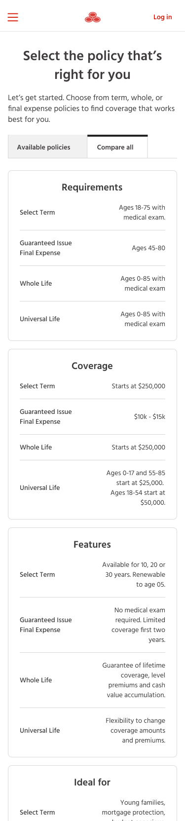
After completing our initial rounds of testing, I am designing a new page that addresses the main issues. I used Figma Make to ideate on solutions and got great feedback on the ideas in the testing sessions. This is still in progress but the work will include:
- Restructuring the page. Elements adjust according to screen size.
- Enhance and add information.
- Adjust the ‘See more details’ links to open a drawer with helpful content like key features, who the policy is ideal for and FAQs.
- Introduce a comparison chart.
- Bring in familiar imagery.
Phase Three
Introduce more active guidance. This could be an AI Chat, a quiz or a new flow where users choose how much help they want. Our user testing sessions proved that customers expect AI to be available to them. The goal is to find a solution that helps customers and also meets guidelines for legal and compliance.
The refresh of this page is still in progress. This has been a rewarding project. It’s incredible to lead an effort that takes a faulty page and experience and guide it towards something that is more intuitive and helpful. Life insurance is daunting enough, the online application process does not need to be.
