About:
When I joined, the Enterprise Policy Office (EPO) was in the middle of an entire policy process revamp. They were redoing all policy tools and sites, from policy creation, editing, reviewing and consumption.
Platform: Web, desktop
My role:
Product and Content Designer
Responsible for written content, research, mockups, prototypes and contributed to story writing.
Worked with Engineering Manager and Business Analysts.
Please note: Many items I was unable to download and take with me for proprietary reasons.


Objective:
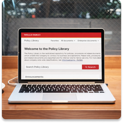
To rework the policy consumption side of the business. There was a current Policy Library in use, but it was old, clunky and not optimized for the user’s experience.
Goals:
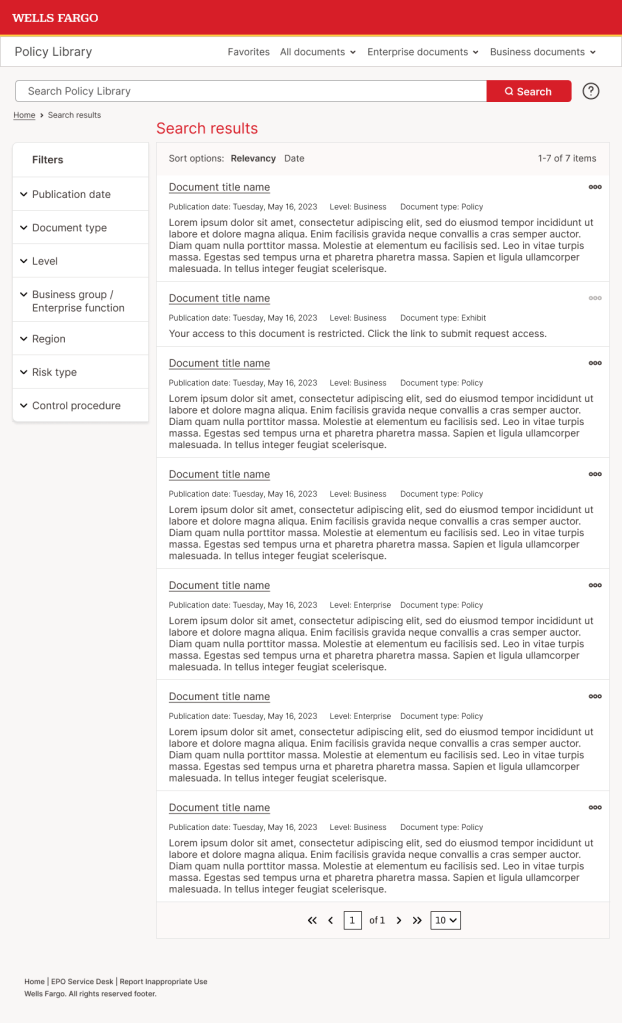
- Improve search. Users wanted to search for documents but it was a disjointed experience.
- Increase legibility. Text was small and hard to read.
- Introduce white space. The library felt cramped and claustrophobic.
- Enhance My Policies. The name of the page was misleading. Are these documents I’ve saved or documents that I own? A lot of wasted space also meant users couldn’t view more than a few at a time. It was widely under-utilized.
- Streamline navigation. The primary navigation used terms not all users were familiar with. What’s Enterprise vs Business? The sub ladder navigation on other pages was overwhelming and crowded.
What I did:
- Met with a Product Owner and other stakeholders to understand the current state of the library and what their goals were. Was it a complete gut job? Or a facelift?
- Reviewed past research that had been completed.
- Hosted several rounds of open table discussions with users of the Policy Library. How did they use the library? How did they find documents? What did they do with the documents? What worked and what didn’t?
- Competitive analysis. I researched other policy libraries, looking for patterns we could apply.
- I started with low fidelity wireframes. These were reviewed with the EPO team regularly and went through several rounds of iterations.
- Once the team felt comfortable with the direction, I moved to high-fidelity designs. I brought in the development team to better understand what would potentially be a risk to the launch timeline.
- From there, it was fine-tuning the designs. I made clickable prototypes to review progress on leadership calls. I re-worked designs that we identified were leaving out a use case or were not intuitive to the every day user.
- Throughout the process, I collaborated regularly with Business Analysts, Product Owners, stakeholders, design and development.


Wire framing process:
Once I had an understanding of the Policy Library’s weak points, I began the complicated process of understanding the hierarchy of how documents are organized. The current library was utilizing a crowded tree ladder structure to show document relationships. I used wireframes to communicate early ideas with the team and for me to understand what would or would not work due to those document hierarchies.
There were many wireframes and general discussions, these are just some examples of wireframes I built.
Once there was agreement on the direction of the library, I moved into higher fidelity mockups. There was already a small library of components my design colleague had created. I pulled what I could, but did contribute components of my own to meet the functionality needs. Wells Fargo also has en extensive component library which I referenced to see if something I needed had already been created.
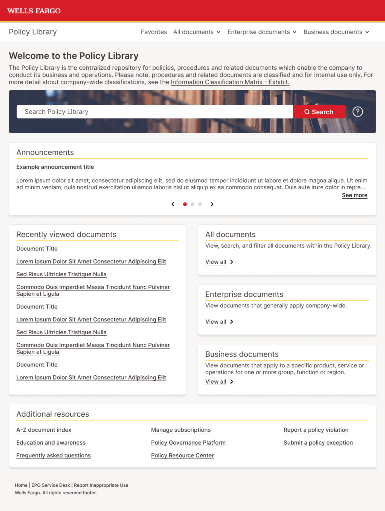


The new Policy Library does the following:
- Prioritizes Search as the main tool to find documents. We gave it a heavier weight and visual prioritization on the home page.
- Defines Enterprise and Business documents. Dividing documents in these categories is how Wells Fargo categorizes their documents, but it’s not lingo that’s understood across the company.
- Reserves your recently viewed documents, allowing users to easily locate a document they need to view again. Not all users may need documents enough to favorite them, this still allows an easy continuity of work.
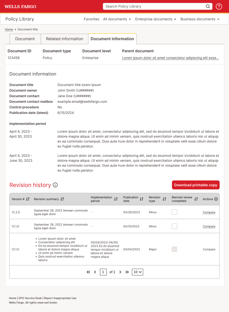
- Utilizes tabs on the View Document page. This lets the user quickly access all relevant information for a document without having to leave the page or having multiple clicks to find information in an obscure place.
- Presents important information for each document (such as ID, name, document type and publication date) before the user has to click into the document. Now, the user is enabled to correctly identify the desired document before additional clicks or steps into the process flow.
- Allows the user to control subscriptions in the library. Previously, subscriptions were handled on another site. Having them under one metaphorical roof increases clarity and visibility.
- Organizes documents into a visual hierarchy that does not clutter the page.
I referenced a lot of my history in e-commerce for the library. Using one site-wide search and left-hand filters were familiar ways the user could search for documents. I leaned on designs my colleague had already created for other parts of the policy process, so there would be continuity through the user’s experience. After many rounds of design feedback, the end product took a card-like approach, with white space and larger text. Accordions and other expandable components also feature heavily in the design, allowing the user to access lots of information but not crowding the screen and taking up load time.
 Hali Diaz